I cut of a big piece of canvas and put it on my work table and my intention was to make a big random background that I would paint over, and just reveal "bits" of it under the next layer.
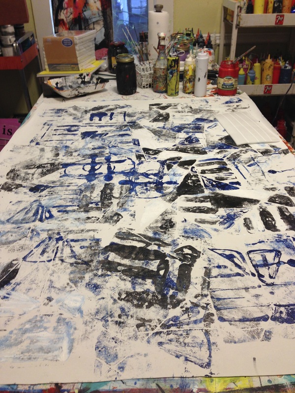
I took out some templates that I had carved a few years ago and filled up the canvas.
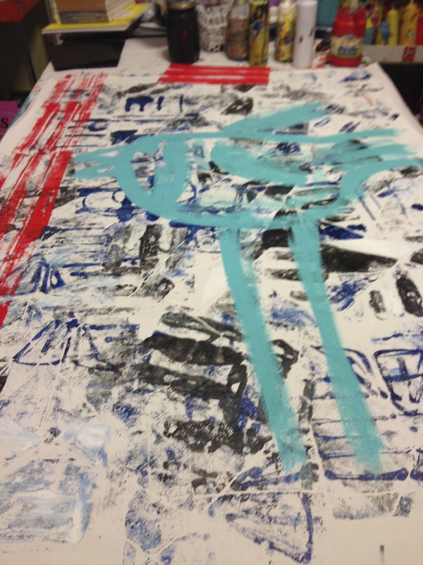
OK. Maybe a very abstract bird on top of that. Then some, uh, bars, yeah, like the idea of a bird cage on top of that! Oh! I was going full steam ahead now!
Ewww.
That looked like crap.
Bad bad idea on top of
horrible color choices.
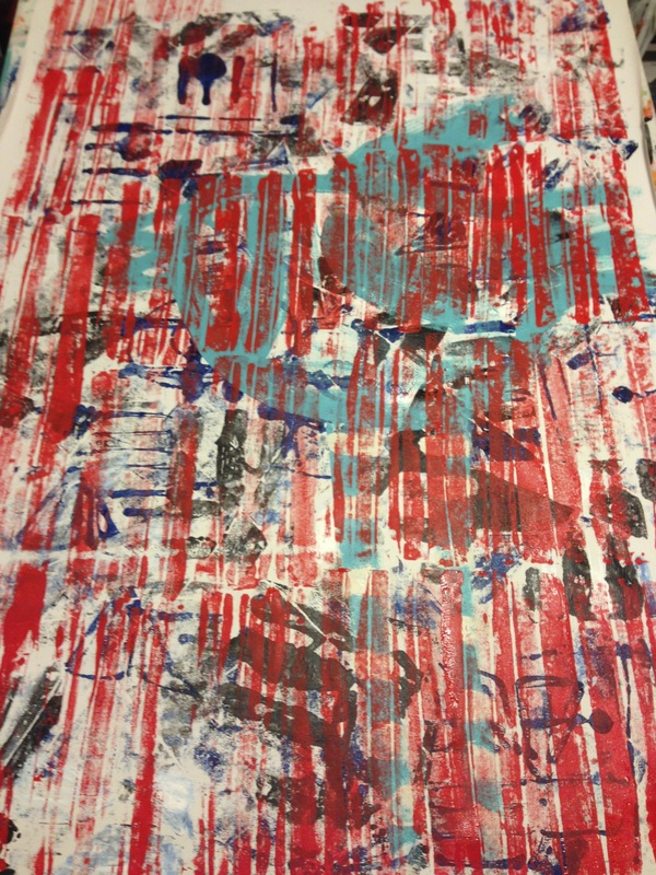
I went home for the night,
thinking that perhaps in the
morning it would look better.
Nope.
Still crap.
Well, the price on the canvas I buy has more than
doubled, so no wasting it allowed.
So how to make it better?
That looked like crap.
Bad bad idea on top of
horrible color choices.
I went home for the night,
thinking that perhaps in the
morning it would look better.
Nope.
Still crap.
Well, the price on the canvas I buy has more than
doubled, so no wasting it allowed.
So how to make it better?
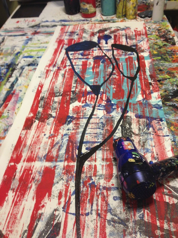
I cut the canvas in half - cause there was just TOO much ugly to look at.
Sometimes, I can almost taste when colors and patterns don't jive and that one was like something from the forgotten reaches in the back of the fridge.
It was
N A S T Y.
I painted some flower
pod things on top of it.
Getting better….
Like some mouthwash after barfing.
Sometimes, I can almost taste when colors and patterns don't jive and that one was like something from the forgotten reaches in the back of the fridge.
It was
N A S T Y.
I painted some flower
pod things on top of it.
Getting better….
Like some mouthwash after barfing.
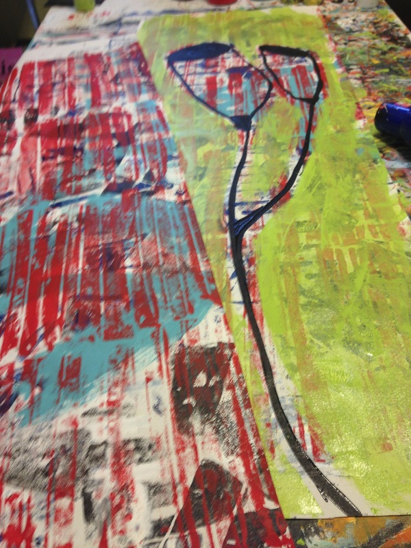
Here's the two halves.
I painted the background green to cover most of the icky colors and let just a shadow of them show through.
I was liking this and could hardly wait to paint the other half!
I will post a photo when I get
to the studio today.
They came out great.
I painted the background green to cover most of the icky colors and let just a shadow of them show through.
I was liking this and could hardly wait to paint the other half!
I will post a photo when I get
to the studio today.
They came out great.
 RSS Feed